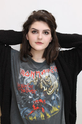
Out of these photos, I will choose which ones I like best to use for a double page spread and as an additional image for my contents page. I'll do my best to make sure the selected photos are clear, fit the colour scheme and overall look of the page, and don't interfere with the visibility of text or other aspects of the page.
Here's a sample of photos from the studio photo shoot. I ensured I took photos from the waist up and portrait to be suitable for my front cover. Most of my photos use direct address although there were a few I liked without this mode of address which I could use for additional photos on other pages of my magazine.

I will decide which of these photos would be the best choice for my magazine front cover by choosing one that uses direct address and suits the genre of Indie Rock the most. I'll ask the opinions of people of the target audience through social media to see what they'd like to see as a front cover.


No comments:
Post a Comment