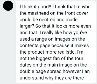
I asked people the opinions of the first draft of my magazine to see what could be improved and what people like about it. I made sure this audience was part of my target audience of people aged around 15-25 of both genders. Here are their responses:

In response to this feedback, I will change my magazine in the following ways. I'll make the masthead on the contents page centered and slightly larger and add more stroke to aspects of text that I want to look more noticeable. I'll change the main image on the contents page to something that has a background and stands out a bit more so doesn't blend in and add black borders to my images to refine them. I'll also make some text stand out a bit more to make it easier to read and draw the eye. On the front cover I'll add another cover line to fill in a gap and add a web address to add some more professional features to it.


No comments:
Post a Comment