Front Cover
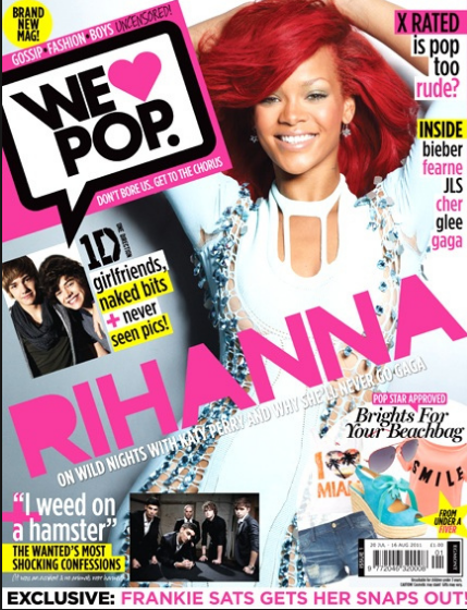
- Mast head at the top left - first part of the page that is looked at
- variety of fonts - makes the page look more interesting and eye-catching.
- Cover lines/Tag lines - informative.
- Colour Pallet - attract target audience.
- Price
- Date and bar code - often small at the bottom or hidden at the top.
- Slogan - memorable for the readers which helps identify the magazine.
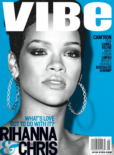
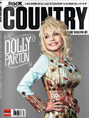
- Main image of model - it must represent the genre and appeal to the target audience.
- Direct Address - makes it seem more personal.
- Model looking at the camera - bonds the model and the reader.
- Close up/Medium shot/Group shot - allows the viewers to see their facial expressions and body language.
- Feature article must be bigger than the rest of the cover lines - stands out.
- Name of the artist/Main feature - appeal to fans and inform readers about the contents of the issue.
- Strapline - insight to contents of magazine
- Puff - free gift
Contents Page
- Issue number - important information.
- Name of the magazine - brand identity.
- Subscription and contact information - opportunity to buy more issues
- Colour scheme matching the rest of the magazine - looks more proffessional.
- Categories of the content of magazine - makes content easy to locate
- Photography - visual content to break up the text and make the page more visually pleasing
- Page Numbers - easy to navigate around the magazine
Double Page Spread
- One large main image - reflects genre.
- Direct Address - adds a personal touch.
- Quote, often presented as a headline - break up the text to make it more appealing.
- Size 11 text - professional size that is readable but not too large or small.
- By-lines - separate to the articles, introduction to article, second largest on the page, works with the headline and image to tell the audience what the article is about.
- Drop capital - indicates where to start reading on the page.
- Strap - at the top indicating what the article is about.
- By-line - journalists and photographers name, credit for articles and photos .
Colours and conventions used with genres
- Rock - Dark and mysterious, stick to a colour scheme, dark background, cover lines are highlighted in bright colours
- Pop - bright and colourful, pink, purple, red, white, purple, visually stimulating for audiences aged 6-16, often include celebrity gossip


- Urban - change in colour schemes, sometimes dark or sometimes colourful
- R&B – bight and dark colours for contrast
- Classical – subtle colours, often include an instrument
- Dance – live and energetic, colourful or stand out in some way


No comments:
Post a Comment