There are several different types of font with Serif, Sans-Serif being the most popular. Serif fonts have a small line attached to the end of a stroke in a letter symbol whereas Sans-Serif is a letter that doesn't have an extending feature at the end of stokes. Sans-Serif fonts tend to have less line width variation than Serif fonts as they are often used for headings and to convey simplicity and minimalism. Other types of font include script font which is known for being elegant, light and professional. Display font is often found on movie posters, newspapers, banners etc. Hand lettering fonts have characteristics of hand written text which adds a sense of realism and a human element to them.
Tracking and kerning are important features when it comes to the spacing between letters and characters.
Tracking is the adjustment of space for complete blocks of text. It is the consistency between the spacing between letters that can be increased or decreased. Tracking can be used to make text look more airy or more dense which all affect the appearance and ability to read the text. It can be applied to small portions of text or whole blocks at a time.
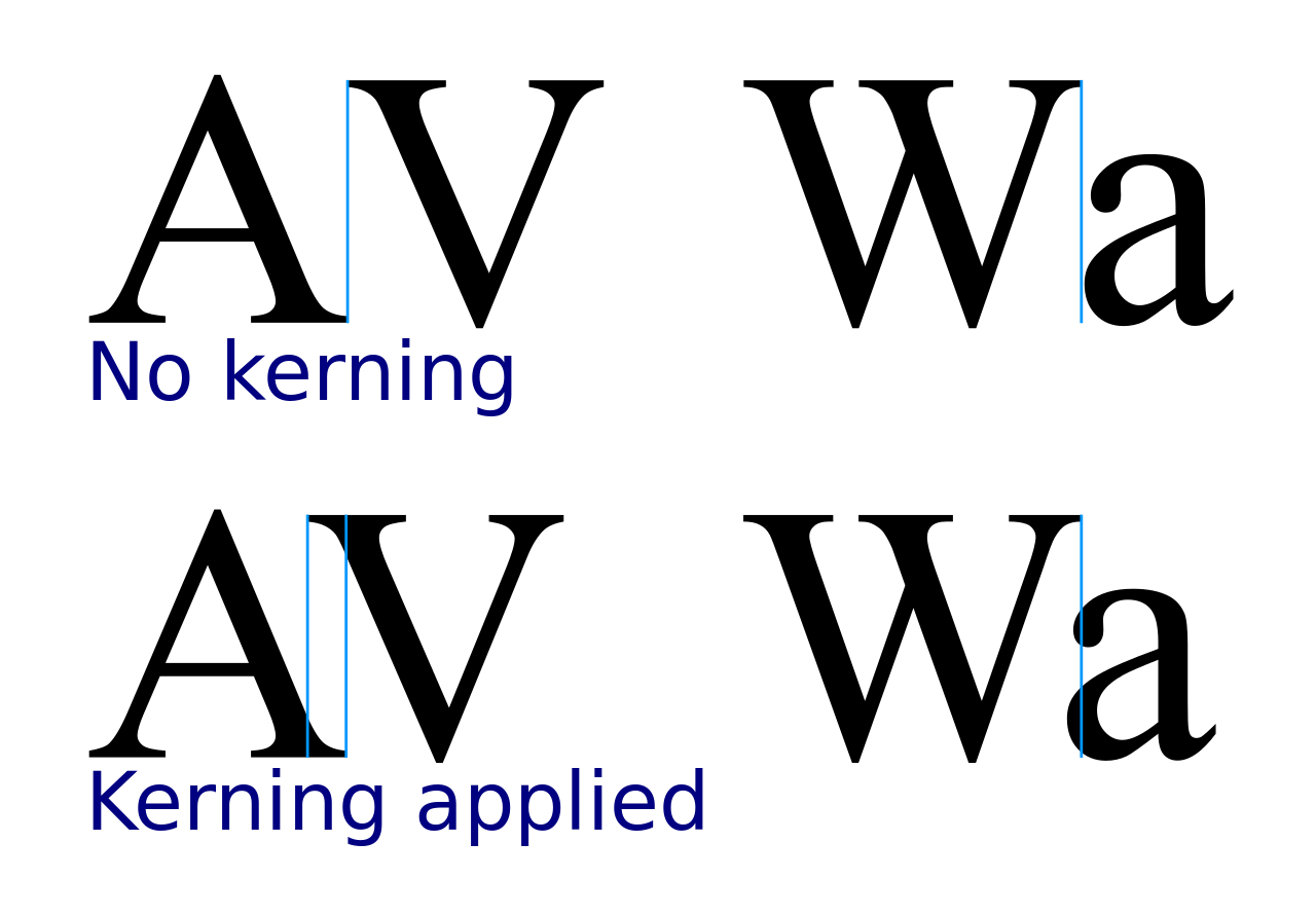
Kerning is another important feature when it comes to typography. It refers to the process of adjusting the spacing between characters in a proportional font to look visually pleasing. It makes the text look more realistic and less computerised which is a pleasing feature when considering the layout of text. If kerning is not used then it could make the text more difficult to read or not appeal to the audience.

When creating text it is important to make it legible, visually striking, and applicable to the situation. For example, at a child's birthday party you'd want the font to look fun and something that gets their attention, whereas if you were writing an important document then the font would need to look sophisticated and professional. You can also align the text to be in the centre or to the let or right which may help it be more readable. The weight of the text is also important because it can make certain words or blocks of text stand out more than others which can draw they eye of the reader.
When designing my music magazine I will ensure I use an appropriate colour scheme for my chosen genre, follow the conventions as best I can and pay close attention to the typography to make it look as aesthetically pleasing as possible.


No comments:
Post a Comment