Wednesday 29 March 2017

Construction of the Magazine After Feedback

 Front Cover


After receiving feedback using social media, I moved the masthead to the centre of the page using the transformation tool, added another coverline to fill space using the horizontal type tool, included a web address below the barcode also using the horizontal type tool, and moved the ‘articles with’ text so it don’t overlap the model.

Contents Page


After feedback from asking the opinions of people over social media, I have changed the main image and added black borders around every image using the stroke tool and changed the sizes of the photos to fit nicely with the rest of the page.


I added small textboxes on each photo using the horizontal type tool and used the transformation tool to fit them to the sizes I wanted and overlapped them on the images. I also altered some of the text of the page by selecting the type tool and clicking on the text box I wanted.


Tuesday 28 March 2017

First Draft Feedback

I asked people the opinions of the first draft of my magazine to see what could be improved and what people like about it. I made sure this audience was part of my target audience of people aged around 15-25 of both genders. Here are their responses:


In response to this feedback, I will change my magazine in the following ways. I'll make the masthead on the contents page centered and slightly larger and add more stroke to aspects of text that I want to look more noticeable. I'll change the main image on the contents page to something that has a background and stands out a bit more so doesn't blend in and add black borders to my images to refine them. I'll also make some text stand out a bit more to make it easier to read and draw the eye. On the front cover I'll add another cover line to fill in a gap and add a web address to add some more professional features to it.

Monday 27 March 2017

New Double Page Spread Plan

After trying to construct my magazine double page spread, I decided to change the layout and images used as they didn't allow me to make my magazine look as professional and as easy to read as I had hoped. The text was difficult to read over the black and white background of my original photo so I've decided to change the main image and separate it to have it on only one side of the spread with the text on the other with a white background. My main image will stand out and not have any text over the model and my main cover line will be at the top of the page with a pull quote in the middle of the text to break up the amount of writing to make it more appealing to the reader. I believe that by keeping the main image and main article separate on the page will make it look more aesthetically pleasing and enable the audience to want to read it and be interested by its contents. By organising my page like this I am still being consistent with the conventions yet still adding unique aspects to the spread that'll attract my target audience who are looking for something different and new to read.

Constructing the Magazine

Front Cover


Firstly, I opened the image and selected the horizontal type tool to add the masthead and main cover lines. I placed a rectangle shape of a block colour underneath this text and used the transformation tool to make it the width of the page.


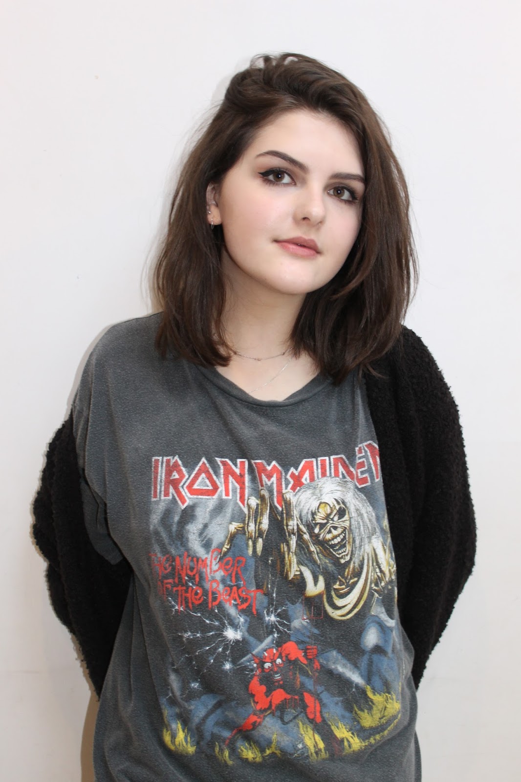
I added some cover lines to fit in with the outline of the model so they’d be easy to read and not cause much difficulty to read by the viewers. I did this by using the horizontal type tool.


I then added another coverline and changed the stroke of it to allow the letters to be easier to read. I did this by clicking on the layer and selected the layer style of stroke, then adjusted the size of the stroke to the appropriate amount. 


 Here I have added a puff by placing a circle shape on the cover and adjusting its opacity to give it a more transparent look so it blends in with the page. I then added a text box over the top of this shape and changed the stroke size to allow it to stand out.


Here I have added a barcode to the bottom corner as well as more text using the horizontal text tool, and another puff using the same method as previously.


 I applied the stroke tool to the main texts on the page to make them easier to read and stand out a little more to make it look appealing.

Contents Page


Here I have added the title using the horizontal type tool and added a shape underneath the text using the shape tool. I have also added two images using the transformation tool to get them to the sizes I like and position them into place.


I’ve placed all the photos and text I wanted for this page using the horizontal text tool, I changed the colours and sizes of words by highlighting them with the mouse and then altered them by selecting the colour and size features.


Here I decided to replace one of the images with a box with subscription information. I deleted the layer of the original photos and replaced the space with a black rectangle shape and added a red stroke to it by selecting the stroke tools. I then added a text box over the top of it showing the subscription information and changed the sizes and colours of them using the text size and colour features.


I then added an image of the front cover by copying and pasting an image of it onto the page then transforming it to the size and position I wanted. I opened a saved image of the Facebook logo and used the transformation tool again to adjust the size and positioning of it then added another text box next to it stating the Facebook link.

Double Page Spread


This is a screenshot from my original double page spread in the making. I decided to change the image and layout as it was difficult to read the text over the image as well as keeping it consistent with my colour scheme. It was also hard to make certain aspects stand out over others. I didn't think this method would produce the best outcome I could have achieved from this spread.

Here is a second attempt of my double page spread to try and see if a different main image would look better and allow the text to be read more clearly without blending into the background. I decided against this layout too and decided that it would look better to have the article of a page without a distracting background with more attention being focused on the main image separately.


I opened a document to landscape A3 size and placed by main image to A4 size on top. I changed the colour of the white background to a creamier colour to make it less harsh and blend in to the rest of the double page spread better.


Here I added the article and title using the horizontal type tool and copy and paste. I changed the font, sizes and colours of the questions and responses by highlighting the desired text and altered them using the option boxes.


I decided to keep all the main text on one page rather than overlap the title on the main image so I moved the text using the transformation tool. I added a photo at the bottom by opening it in a tab, then dragging the image onto the spread. 


I changed the colours of the title to make it stand out more and added a shape underneath the name of the artist by using the shape tool and transforming it to the size I wanted. I added a drop capital by making a new layer and moving into place and altering the positioning of the first three lines of the article so it would fit. I included a pull quote simply by adding space around the text in the text boxes and placing a new text box in the space with the letter in it.


I added a shadow to the title of the article by using the drop shadow option and choosing the size I wanted. I also added page numbers using new text boxes and adjusting the size and positioning of them to how I wanted.


 I typed tour dates around the main image and adjusted the stroke of them by selecting the stroke option and changing the size.

Front Cover Image Social Media Feedback

I asked the opinions of what image to use for my front cover with responses taken from my target audience. This is what they said:


From this feedback, I've decided to use option 2 as my front cover image as it was the majority vote and I agreed with their reasons. I believe it would represent the genre well as she is wearing a band t-shirt which would appeal to more fans, She is using direct address which will engage the audiences attention and there is space around her to add cover lines and a masthead without it looking too cramped.

Friday 24 March 2017

Hand Drawn Drafts of Magazine


Here are my hand drawn drafts for my magazine, when designing it I tried to comply to as many conventions as I could that I thought would be necessary to include. I sketched a representative shape of a person so I could position my cover lines and other aspects around it to see what would fit and look best. I overlapped the main cover lines over the main images on the front cover and double page spreads to show their importance to the image. I've included puffs to grasp the attention of the reader to encourage them to read the magazine and included the names of bands on the front cover to appeal their fans which would hopefully gain their interest in my product. My contents page is split up into sections to break up the information and allow it to be navigated easily and inform the readers effectively on what would be included. I plan to use various imaged and perhaps add a subscription box to the the bottom of the page if I feel it would improve the look of the page and make it look more professional. I tried to keep an even ratio of images and text to keep it interesting and not overwhelm the reader with information that may put them off. I wanted the main image on my double page spread to take up the whole space with everything else overlapped on top to show it is all linked and relevant to this image. I'll include smaller images around the page to add other aspects to look at and use a pull quote to interest the reader with the main article. I plan for most of the text to be written on the left hand side of the spread and the model to be on the right side. I'm keeping the colour scheme consistent throughout these pages as well as the font, style of photos and mode of address to keep it fluent and connected which would appeal to the audience and make it look aesthetically pleasing.


Thursday 23 March 2017

Photos

Here are some of the photos taken from the Camden photo shoot in various locations. I used many backgrounds to give myself lots of options to choose from and get the perfect shot. I used long shots and some mid shots for these photos as I wanted to keep the outfit in visible as well as being able to clearly see the background.


Out of these photos, I will choose which ones I like best to use for a double page spread and as an additional image for my contents page. I'll do my best to make sure the selected photos are clear, fit the colour scheme and overall look of the page, and don't interfere with the visibility of text or other aspects of the page.


Here's a sample of photos from the studio photo shoot. I ensured I took photos from the waist up and portrait to be suitable for my front cover. Most of my photos use direct address although there were a few I liked without this mode of address which I could use for additional photos on other pages of my magazine.


I will decide which of these photos would be the best choice for my magazine front cover by choosing one that uses direct address and suits the genre of Indie Rock the most. I'll ask the opinions of people of the target audience through social media to see what they'd like to see as a front cover.

Improvements to my Final Product

After receiving some feedback on my final products, I decided to make some last minute changes to improve the final outcome. Here...