Monday, 27 March 2017

Front Cover Image Social Media Feedback

I asked the opinions of what image to use for my front cover with responses taken from my target audience. This is what they said:


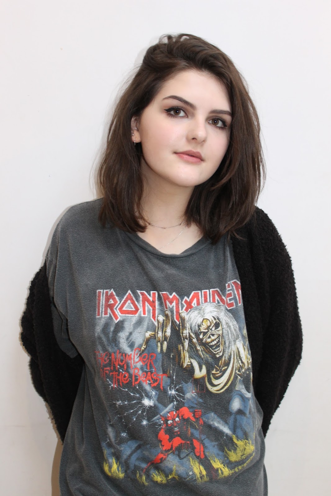
From this feedback, I've decided to use option 2 as my front cover image as it was the majority vote and I agreed with their reasons. I believe it would represent the genre well as she is wearing a band t-shirt which would appeal to more fans, She is using direct address which will engage the audiences attention and there is space around her to add cover lines and a masthead without it looking too cramped.

Friday, 24 March 2017

Hand Drawn Drafts of Magazine


Here are my hand drawn drafts for my magazine, when designing it I tried to comply to as many conventions as I could that I thought would be necessary to include. I sketched a representative shape of a person so I could position my cover lines and other aspects around it to see what would fit and look best. I overlapped the main cover lines over the main images on the front cover and double page spreads to show their importance to the image. I've included puffs to grasp the attention of the reader to encourage them to read the magazine and included the names of bands on the front cover to appeal their fans which would hopefully gain their interest in my product. My contents page is split up into sections to break up the information and allow it to be navigated easily and inform the readers effectively on what would be included. I plan to use various imaged and perhaps add a subscription box to the the bottom of the page if I feel it would improve the look of the page and make it look more professional. I tried to keep an even ratio of images and text to keep it interesting and not overwhelm the reader with information that may put them off. I wanted the main image on my double page spread to take up the whole space with everything else overlapped on top to show it is all linked and relevant to this image. I'll include smaller images around the page to add other aspects to look at and use a pull quote to interest the reader with the main article. I plan for most of the text to be written on the left hand side of the spread and the model to be on the right side. I'm keeping the colour scheme consistent throughout these pages as well as the font, style of photos and mode of address to keep it fluent and connected which would appeal to the audience and make it look aesthetically pleasing.


Thursday, 23 March 2017

Photos

Here are some of the photos taken from the Camden photo shoot in various locations. I used many backgrounds to give myself lots of options to choose from and get the perfect shot. I used long shots and some mid shots for these photos as I wanted to keep the outfit in visible as well as being able to clearly see the background.


Out of these photos, I will choose which ones I like best to use for a double page spread and as an additional image for my contents page. I'll do my best to make sure the selected photos are clear, fit the colour scheme and overall look of the page, and don't interfere with the visibility of text or other aspects of the page.


Here's a sample of photos from the studio photo shoot. I ensured I took photos from the waist up and portrait to be suitable for my front cover. Most of my photos use direct address although there were a few I liked without this mode of address which I could use for additional photos on other pages of my magazine.


I will decide which of these photos would be the best choice for my magazine front cover by choosing one that uses direct address and suits the genre of Indie Rock the most. I'll ask the opinions of people of the target audience through social media to see what they'd like to see as a front cover.

Inspiration: Double Page Spread

I found that most music magazine double page spreads use direct address at a mid shot and columns of text which makes it look professional. I've noticed that the model takes up about half of the spread so I'll make sure my main image is A4 size or larger.

Image result for kerrang contents pages  Image result for music magazine double page spread  Image result for music magazine double page spread kerrang

I really like how the main image is used as the background for the double page spread on the third picture as it makes everything on the page look connected and relevant to he rest of the article, it also brings the whole spread together. I like how the titles of these pages are lot larger then any other text on the page and the use of different colours to differentiate important parts. I'll use a drop capital as that is shown to be a key convention of double page spreads. When creating my own spread, I'll ensure I incorporate these aspects as it will make it look more professional and therefore look successful

Costumes and Makeup

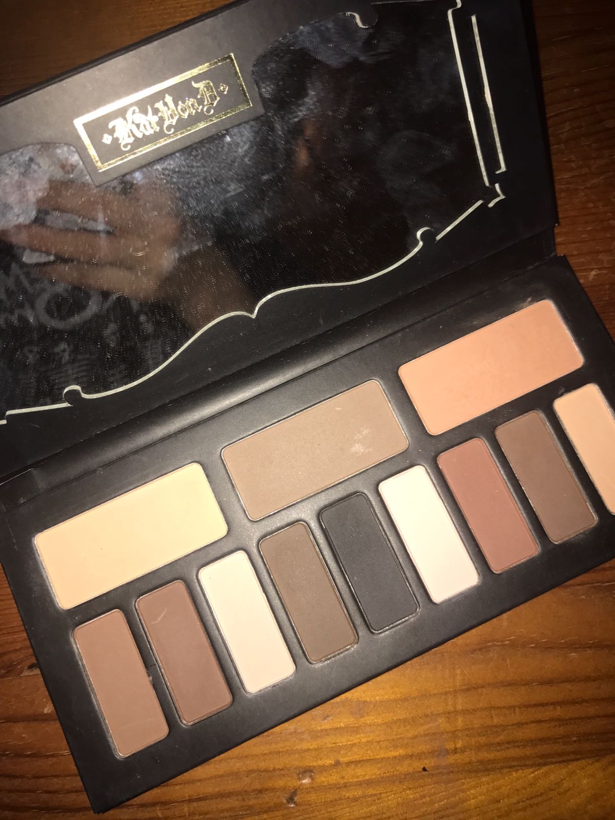
This is the makeup used on my model for both photo shoots. I kept this the same to have some consistency in the appearance of my model so she doesn't look too different in each shoot. I made sure she used dark eye shadow to fit in with the indie rock genre as it would appeal to the target audience and look grown up and stylish which is also a feature I wanted to gain from the model.


For the photo shoot in Camden I got the model to wear a plain dark t-shirt, a black skirt and fishnet tights, a khaki green raincoat and doc martins. She also wore dark eye makeup and accessories such as small silver necklaces and piercings to fit in with the genre. 


For the second photo shoot in the studio, my model wore either an Iron Maiden or Metallica t-shirt to appeal to the rock side of the target audience, plain black tights and a plain black skirt. These were plain because I was focusing on getting Mid shots for this shoot to fit in with the conventions of a magazine front cover. She also wore the same dark eye makeup and subtle necklaces and earrings to appeal to the genre further.


Improvements to my Final Product

After receiving some feedback on my final products, I decided to make some last minute changes to improve the final outcome. Here...