Thursday, 23 March 2017

Inspiration: Double Page Spread

I found that most music magazine double page spreads use direct address at a mid shot and columns of text which makes it look professional. I've noticed that the model takes up about half of the spread so I'll make sure my main image is A4 size or larger.

Image result for kerrang contents pages  Image result for music magazine double page spread  Image result for music magazine double page spread kerrang

I really like how the main image is used as the background for the double page spread on the third picture as it makes everything on the page look connected and relevant to he rest of the article, it also brings the whole spread together. I like how the titles of these pages are lot larger then any other text on the page and the use of different colours to differentiate important parts. I'll use a drop capital as that is shown to be a key convention of double page spreads. When creating my own spread, I'll ensure I incorporate these aspects as it will make it look more professional and therefore look successful

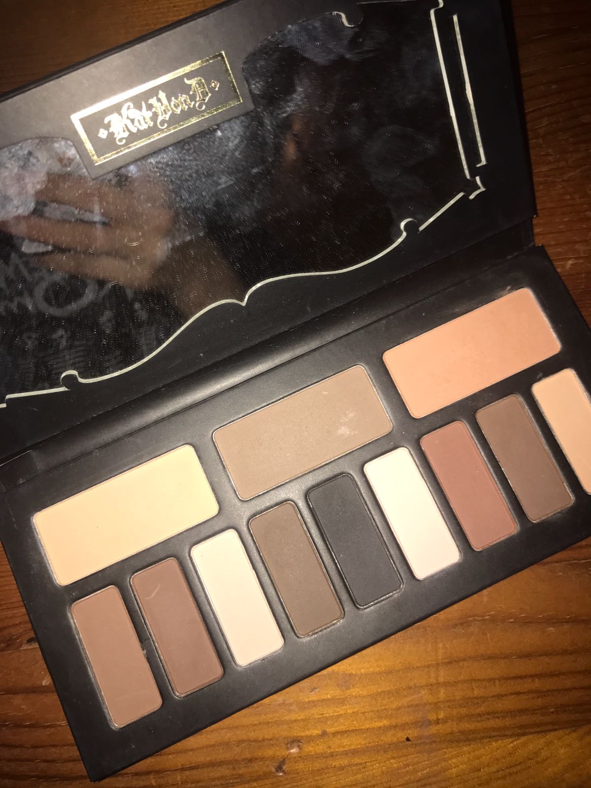
Costumes and Makeup

This is the makeup used on my model for both photo shoots. I kept this the same to have some consistency in the appearance of my model so she doesn't look too different in each shoot. I made sure she used dark eye shadow to fit in with the indie rock genre as it would appeal to the target audience and look grown up and stylish which is also a feature I wanted to gain from the model.


For the photo shoot in Camden I got the model to wear a plain dark t-shirt, a black skirt and fishnet tights, a khaki green raincoat and doc martins. She also wore dark eye makeup and accessories such as small silver necklaces and piercings to fit in with the genre. 


For the second photo shoot in the studio, my model wore either an Iron Maiden or Metallica t-shirt to appeal to the rock side of the target audience, plain black tights and a plain black skirt. These were plain because I was focusing on getting Mid shots for this shoot to fit in with the conventions of a magazine front cover. She also wore the same dark eye makeup and subtle necklaces and earrings to appeal to the genre further.


Wednesday, 22 March 2017

Inspiration: Contents Page

By researching contents pages for indie rock magazines, I found they usually have a white background with images and text on top in a neat arrangement. The text is in columns with subheadings to give the information a structure.

Image result for indie rock contents pages      Image result for kerrang contents pages      Image result for music magazine contents pages nme

Some of the aspects I like about these contents pages are that you can clearly see the main image and there are other smaller images to break up the text and give the page more visual features which i think looks more appealing. I like the subscription box in the corner as it is informative and how all the text stands out and is all easy to read. The pages have a lot of information on them but don't look too cramped or cluttered with unnecessary material which is something I think looks good about the layout of these pages. The photos are labelled with page numbers to make them relevant to the rest of the magazine and I like how there are references to more articles in the magazine.

Inspiration: Front Cover

After researching many different types of music magazine front covers, I noticed that many of them use a plain background of black or white which helps draw the attention to cover lines and the main image without having distractions from the important features of the cover. They also use multiple puffs and the main cover line often overlaps the main image.

Image result for indie rock magazines     Image result for indie rock magazines     Image result for indie rock magazines

I like that two of these covers use a colour scheme of red, white and black as it proves I have chosen an appropriate scheme for my own magazine and it shows it works well with professional magazines of similar genres. The words are written clearly and are in capital letters which makes them easy to read and draws the eye. The cover lines are written around the shape of the model which makes it look neat and well designed and all of these models are using direct address which engages the viewer. I will try to incorporate these aspects into my own magazine because I think they make it look refined and aesthetically pleasing, therefore successful.


Tuesday, 21 March 2017

Double Page Spread Article

April has become well known this year exploding into the charts with her new album 'Fallen Moonlight'. We were lucky enough to have a chat wit her after her gig at the O2 academy Islington... 

Hi April, great meeting you. What first inspired you to make music?
Well I’d regularly go to open mic nights with a few of my friends and after a long time of going just to watch and support, we thought it would be a fun idea to make our own performance as is only in front of a few people that we know anyway. My friends had more musical talent than me and knew how to play instruments so I got forced to having to sing which was the most nerve wracking part for me, but I didn’t feel intimidated as I knew everyone would be supportive and that it was all just for fun so I went for it. I realised it was actually really enjoyable and people told me afterwards that my voice was good and that I didn’t seem scared at all! I think that was when I realised I wanted to peruse a career in music just because of the feeling I got on stage that was powerful and took away any nerve or anxiety I had. 
How has music influenced you? 
I never really learnt an instrument, like I’d play around with them if they were there like a piano or guitar laying around, even try and make a beat with drums if I could get my hands on some drumsticks. So I’d say listening to music I like opened doors to help me find my passion for it and gave me enthusiasm to try and produce something to try and inspire other people the same way I was. I grew up listening to so many bands, the main ones would be Biffy Clyro, The Neighbourhood, The Arctic Monkeys, Green Day, Nirvana… Every band or artist I’ve interacted has had some sort of influence even if I don’t realise it. I think they taught me to just do what I love without worrying about it or thinking too much about consequences because they’ll hold you back and never lead you anywhere.  
How are you enjoying your new found fame? Was it difficult getting used to or did you feel you fit in straightaway? 
It was daunting I must admit, but it’s just so exciting everyday not knowing what could come. It was difficult to adjust as I has just l left school so it took time to get used to life in the music industry I’ll always have uncertainties about whether I should have taken the uni option, but everyone is just so nice and understanding. They let me go at own pace and ask me about everything that I could do or want to do before doing it and make sure I’m completely comfortable. It’s so brilliant to have an impact with what I do and I just want to show people that they shouldn’t think there are restrictions to life because there really aren’t, and if I made it, then anyone can. 
Have you got any plans for the future?
I should be touring with Halsey this year which is really exciting as I’ll get to perform alongside one of my idols and be a part of her success. It’ll be nice to really see what it’s like to perform in front of a bigger crowd, rather than a group of people I know in a church hall. Other than that I’m hoping to release a new album soon of which I hope to receive positive feedback, so hopefully you’ll be seeing more of me this year. 

Monday, 20 March 2017

Planning Photoshoot 2 (Studio)

Location/sets
Studio
  • Plain white backdrop
Photographer
Kaylee Heckford

Model
Kiera King (April)
Equipment
Canon 1100d Camera

Costumes/Make-up
  • Band t shirt
  • Dark eye makeup
  • Cardigan/jumper
  • Necklaces/piercings
  • Fish nets 
  • Plain shoes and skirt

Transport
321 bus and on foot

Date
7th March 2017

Timings
3:00-6:00

Ideas
Get close-ups and mid-shots as studio photos would be suitable for the front cover so these would fit in with the conventions of a music magazine.
Make sure they're portrait to work with for a front cover.
Use direct address to make sure the audience will be engaged with the magazine cover


Planning the Photoshoot 1 (Camden Town)

Location/Sets
Camden town
  • Graffiti walls
  • Brick walls
  • Natural scenery e.g. rivers, trees

Photographer
Kaylee Heckford

Model
Kiera King (April)

Equipment
Canon 1100d Camera

Costumes/Make-up
  • Fish net tights
  • Black skirt
  • Khaki green raincoat
  • Doc Martins
  • Plain dark t-shirt
  • Dark eye makeup 
  • Necklaces/piercings

Transport
Train to Charring Cross from Sidcup station, tube to Camden town (northern line, north bound) and on foot

Date
15th February 2017

Timings
11:30 - 4:00

Ideas
Take long shots/mid shots from different angles showing the outfit and backgrounds to get a variety of photos to choose from.
Aim to make them suitable for contents page and double page spread as they'll have interesting backgrounds.
Make sure to take landscape and portrait photos.
Use direct address and indirect address to get a range of images that aren't too direct the magazine.


Improvements to my Final Product

After receiving some feedback on my final products, I decided to make some last minute changes to improve the final outcome. Here...