Thursday 12 January 2017

Typography

Typography is the style and appearance of printed matter and the way text is presented and layed out on a page. It includes factors such as font, colour and spacing. It is important to make the magazine appealing to the audience and typography plays a large part in this as it helps grab the attention of the reader which would determine whether they buy it. Having bad typography on the cover of your magazine may undermine the main message you're trying to convey and distract the reader. You'd need to make sure none of the colours contrast eachother and that the text is readable from arms length in order to be eye-catching.

There are several different types of font with Serif, Sans-Serif being the most popular. Serif fonts have a small line attached to the end of a stroke in a letter symbol whereas Sans-Serif is a letter that doesn't have an extending feature at the end of stokes. Sans-Serif fonts tend to have less line width variation than Serif fonts as they are often used for headings and to convey simplicity and minimalism. Other types of font include script font which is known for being elegant, light and professional. Display font is often found on movie posters, newspapers, banners etc. Hand lettering fonts have characteristics of hand written text which adds a sense of realism and a human element to them.


Image result for typography for music magazines

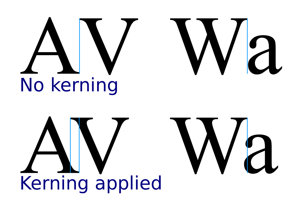
Tracking and kerning are important features when it comes to the spacing between letters and characters. 

Tracking is the adjustment of space for complete blocks of text. It is the consistency between the spacing between letters that can be increased or decreased. Tracking can be used to make text look more airy or more dense which all affect the appearance and ability to read the text. It can be applied to small portions of text or whole blocks at a time.


Kerning is another important feature when it comes to typography. It refers to the process of adjusting the spacing between characters in a proportional font to look visually pleasing. It makes the text look more realistic and less computerised which is a pleasing feature when considering the layout of text. If kerning is not used then it could make the text more difficult to read or not appeal to the audience.
Image result


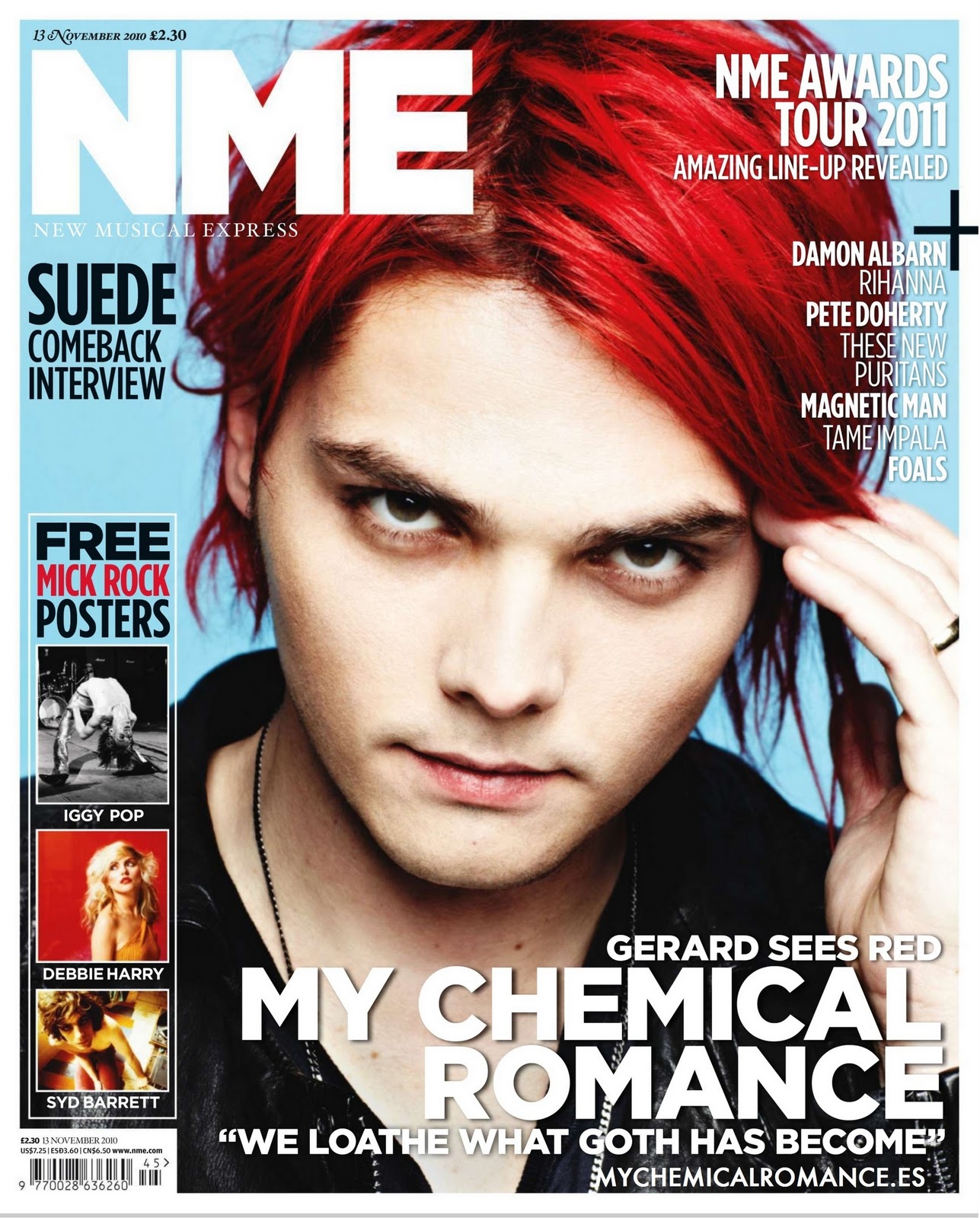
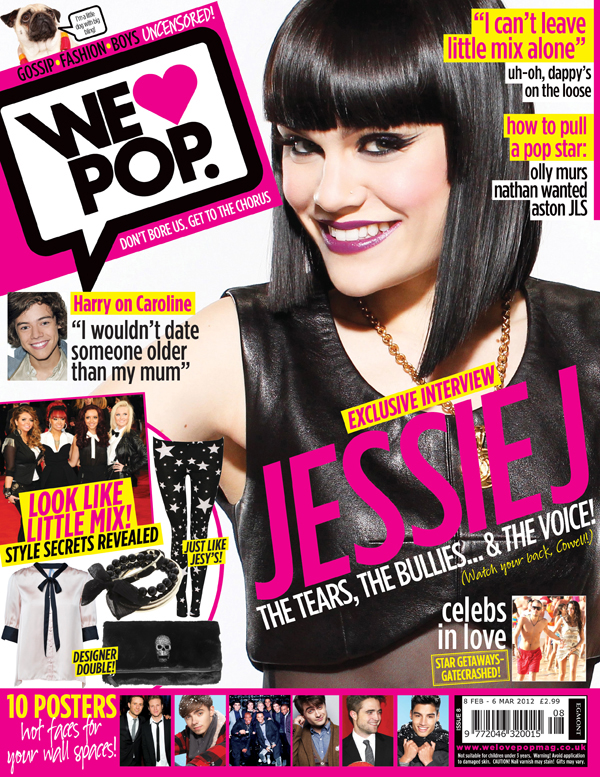
When creating text it is important to make it legible, visually striking, and applicable to the situation. For example, at a child's birthday party you'd want the font to look fun and something that gets their attention, whereas if you were writing an important document then the font would need to look sophisticated and professional. You can also align the text to be in the centre or to the let or right which may help it be more readable. The weight of the text is also important because it can make certain words or blocks of text stand out more than others which can draw they eye of the reader.

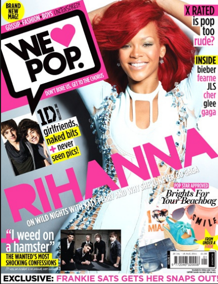
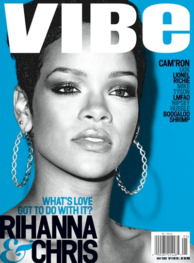
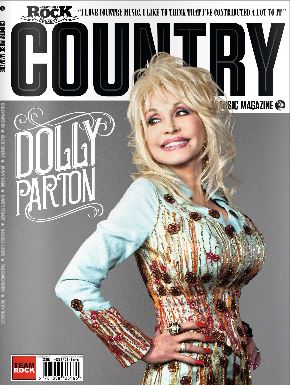
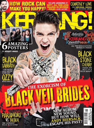
When designing my music magazine I will ensure I use an appropriate colour scheme for my chosen genre, follow the conventions as best I can and  pay close attention to the typography to make it look as aesthetically pleasing as possible.

Monday 9 January 2017

Conventions of a Music Magazine

Conventions 

Front Cover
  • Mast head at the top left - first part of the page that is looked at
  • variety of fonts - makes the page look more interesting and eye-catching.
  • Cover lines/Tag lines - informative.
  • Colour Pallet - attract target audience.
  • Price 
  • Date and bar code - often small at the bottom or hidden at the top.
  • Slogan - memorable for the readers which helps identify the magazine.
  • Main image of model - it must represent the genre and appeal to the target audience.
  • Direct Address - makes it seem more personal.
  • Model looking at the camera - bonds the model and the reader.
  • Close up/Medium shot/Group shot - allows the viewers to see their facial expressions and body language.
  • Feature article must be bigger than the rest of the cover lines - stands out.
  • Name of the artist/Main feature - appeal to fans and inform readers about the contents of the issue.
  • Strapline - insight to contents of magazine
  • Puff - free gift
Contents Page
  • Issue number - important information.
  • Name of the magazine - brand identity.
  • Subscription and contact information - opportunity to buy more issues
  • Colour scheme matching the rest of the magazine - looks more proffessional.
  • Categories of the content of magazine - makes content easy to locate
  • Photography - visual content to break up the text and make the page more visually pleasing
  • Page Numbers - easy to navigate around the magazine
Double Page Spread
  • One large main image - reflects genre.
  • Direct Address - adds a personal touch.
  • Quote, often presented as a headline - break up the text to make it more appealing.
  • Size 11 text - professional size that is readable but not too large or small.
  • By-lines - separate to the articles, introduction to article, second largest on the page, works with the headline and image to tell the audience what the article is about.
  • Drop capital - indicates where to start reading on the page.
  • Strap - at the top indicating what the article is about.
  • By-line - journalists and photographers name, credit for articles and photos    .

Colours and conventions used with genres
  • Rock - Dark and mysterious, stick to a colour scheme, dark background, cover lines are highlighted in bright colours
Image result for music magazines         Image result for rock music magazines
  • Pop - bright and colourful, pink, purple, red, white, purple, visually stimulating for audiences aged 6-16, often include celebrity gossip
Image result for pop music magazines      Image result for pop music magazine      Image result for pop music magazine
  • Urban - change in colour schemes, sometimes dark or sometimes colourful
Image result for music magazines  Image result for urban music magazines  Image result for urban music magazines
  •  R&B – bight and dark colours for contrast

 Image result for r&b music magazine       Image result for r&b music magazine    
  • Classical – subtle colours, often include an instrument 

  • Dance – live and energetic, colourful or stand out in some way

Image result for dance music magazine    Image result for dance music magazine       

  • County – bright and colourful, bright and emotional


Saturday 7 January 2017

What is a Music Magazine?

A music magazine is a magazine dedicated to music and music culture and are created to inform people about the latest music updates. They include music news, interviews, photo shoots, essays, reviews, concert reviews and more. They can often include a free gift such as a mix tape, these gifts are called covermounts. Music magazines focus particularly around specific genres such as Pop, Rock, Indie, Hip-Hop and more to attract a niche audience and appeal to all types of people with their different music tastes. A niche audience is a small, select group of a wider target audience that share a similar interest such as sports or music.

Comparison of genres

Image result for kerrang magazine
Image result for nme magazine
There are key differences between magazines of different genres. For example, NME features mainly Indie and Rock music which would appeal to a more alternative audience as well as Kerrang! which features more Rock and Metal bands. This caters or people who prefer this type of music without having other genres involved in the magazine which makes them specific to a niche audience and would encourage people with these music tastes to find an interest in them.

Image result for vibe magazine
Vibe magazine majorly includes hip-hop and R&B artists. On this cover the audience is shown that it is Drake being featured which would attract fans of him and his type of music and genre. By including artists/music groups on the front cover of the magazine, it reinforces what genre the magazine is based on and attracts the people interested in them.


Image result for pop music magazine
Pop music magazines focus on the popular music of the time and feature the mainstream artists and groups. They include gossip pages as some of their articles which is informative to readers who aspire to be like the artists featured. These gossip pages aren't often found in Rock magazines and they provide information purely about music and have an atmospheric look as they are targeted to an older audience, whereas pop magazines are aimed at young people and teenagers.

Thursday 5 January 2017

Introduction

My name is Kaylee Heckford and I have published this blog to show my progress in creating a music magazine for my A level media coursework. I will produce a front cover, contents page and double page spread using my own photographs, text and appropriate layouts that I put together myself. I will be adding text, images, slideshows and more to demonstrate my progress.

Here is a link to my school magazine made as a preliminary task
http://kayleeheckfordsschoolmagazineas.blogspot.co.uk/

Improvements to my Final Product

After receiving some feedback on my final products, I decided to make some last minute changes to improve the final outcome. Here...